Blog Navigation:

2012/02/17

Challenge from an Artist to Christian Filmmakers, part 2


Challenge 2: Tell a good story.
What story are we serving?  Is the story worth our service?

It's easy when the adrenaline courses through our veins to pursue whatever story comes into our lives.  However, these stories take a while to tell, and involve a lot of energy.  It's not a bad idea to ask whether or not this story is worth all that effort.

Telling a good story means that it is well told.  Does it open in an engaging way?  Does the story lead us into a believable world with meaningful characters?  Does it follow correct plot structure for movies?  Does it move us by the emotion bottled up inside?  If it does, it's probably well told.  I had the wonderful privilege of working with John Moore on a remake of an earlier film.  He created Heartstrings, which was fairly popular, but he knew that he could tell it better.  And so he's created Ace Wonder: Message from a Dead Man as a total retake on the concept.  It carries its message with power and eloquence.

Telling a good story also means that we remember where reality is.  Stories aren't real, but they remind us of what is real.  Even the most bizarre story, if it is a good one, it reminds us of something that is not bizarre.  Men from mars are still men, deep down inside.  They are generally intelligent beings who live by some universal moral code.  The stories we tell are not reality, but deep down inside, do they reflect reality?  

Telling a good story lastly means that we tell God's story.  We humans often act completely oblivious to the good work that God is doing in this world.  Do the stories we tell reflect God's work, or are they, too, oblivious?  The fool says in his heart there is no God.  A foolish Christian lives like it.  And foolish Christian filmmakers do not acknowledge God or His work in their stories.  As Michael Dornbirer once encouraged me, "Write something that'll turn your audiences' eyes heavenward!!"  The market is already filled with films which do not acknowledge God.  By discussing the ignored spiritual reality, we tell a worthwhile story.

And if we tell our stories well, our audience may be the better for the listening.

Digging deeper: James 3:2, Romans 14:19, I Corinthians 10:31

2012/02/16

Challenge from an Artist to Christian Filmmakers, part 1


I am somehow involved in the Christian film industry, though not a filmmaker.  I'm excited about this industry, have been blessed to work on some great films, but I'm learning some in the process.  I hope that you will find them as helpful as I have found them in my own life.

Challenge 1: Serve the story.
The burgeoning Christian film industry is very exciting.  So exciting that we can forget about the most important aspect of the industry: telling stories.  

I've felt the rush.  I've seen it in other's eyes.  The lust for something that movies give us.  It's just really exciting to be a part of that.  In the excitement we must remember that we are merely there to serve the story.  

Serving the story means that we do not seek personal fame and fortune.  The industry revolves around the fulfillment of desire and selfish ambition, but God calls those "earthly, natural, demonic."  Instead God calls us to the gentleness of wisdom.  What is appropriate for this situation?  Do I need to take center stage, or does the story require me to recede into the background?  Others will seek the spotlight to their detriment and to the detriment of the story.  We must, in contrast, seek what's best for the story that we are telling.

Serving the story also means that we work hard to support the story.  In the excitement we can get a little tipsy with the thrill, but the story is not served when we skip over basic tasks like script-writing, storyboarding, and other menial disciplines.  These quieter, less glorious tasks make or break the story.  I've seen many filmmakers dabble at the craft without any real progress.  On the other hand, one of the most principled filmmaking families is working on their first full length feature, Remember.  It promises to deliver the limited budget and major elbow grease that they've poured into it.  Sometimes serving the story requires discipline.

Serving the story also means that we don't rush through the process.  Time is money and money is time, so therefore we need to take the time to get it right the first time.  Because it takes even longer to go back to try it again.  It's been great to work on some films where they did great planning, humbly working hard at the filmmaking job, but I've seen other filmmakers out there flounder.  One filmmaker learned his lesson the hard way and spent 4 years filming a movie that could have been filmed in less than a month.  (His next film will be awesome, though—much more planned out.)  Measure twice, cut once.

So instead of spending our time and money serving our own desires, let's find good stories to tell and serve those stories well.

Digging deeper: Romans 15:1-3, James 3:13-18

2011/11/11

Modeling

A couple weeks ago I enjoyed the chance to model for John Ball's painting night.  John Ball has opened his home for a life painting group, and it's always a pleasure to gather together and try to capture the model's likeness.  

Painting from life is very important for an artist.  Not only does the artist get practice, but he also gets a challenge, and a learning opportunity.  Whenever someone works from their memory or from photographs, they lose some information.  When an artist sits down to paint a model, he sees more information than he can record.  He is always learning something.

That's why it's very important to have good models.  And when we can't get one, we paint ourselves.  I had the extreme privilege to sit for my fellow artists and took the chance to capture some of the experience.

First of all, from the model's perspective, the night looks like this:

Usually we set up the model, try a couple poses and then dive in.  We work in 20 minute painting sessions with 5-10 minute breaks for the model.  It's great time to think and dream.

And you get to see amazing artwork created before your very eyes.  John Ball has graciously allowed me to post his small demonstration sketch for your amusement.  I took a photograph every break, so here is an evening's painting condensed into a matter of 10 seconds. 


To see more of John Ball's beautiful paintings, check out his website.  (His blog is amazing too!)

2011/10/14

Grandma Harriet

I took a break last night and sketched my great grandma who recently passed away.  My sketch does not do justice to her spunky, sweet, practical personality.  Her memory is a treasure.


After finishing I remembered how she looked in the casket, and missed her...  But while I was painting, I saw her smile, heard her laugh, and remembered many happy memories.  She was a great grandma in many ways.

2011/09/30

Hobbit Proportions


Hello again!  This is what my dad might look like as a hobbit.  Therefore, I'm going to call him Papa-o.  And just for today, he's got three brothers who look awfully like him, but yet not so much.

Meet Rotundo:
He received the bulk of the family genes.

And Sticko:
He's the middle child and he got squished.

And Doc:
Who inexplicably was born with the eleventh Doctor Who's legs.

You can see the family resemblance can't you.  They all look very much the same... and yet they look slightly different....  Maybe it would help if we stuck them all in a row:

An artist will often use the same colors to make objects that are very different.  So, how did I make these three characters look different?  

Well, it's not in the face, even though each face has a different expression.


I made them look different through the body proportions.  Papa-o has the most normal proportions.  I made Rotundo wider, even making his legs and arms wider.  Sticko is thinner, and if you look real closely, you'll notice that his legs are even thinner.  The Doc is much taller with legs of normal proportions under a hobbit body.

Notice further... where did I put the stomach of each character in his body?  And how big is that stomach?  Where did I put his knees?  How much space did I put between each characters legs?  How wide did I make each leg, and does it stay that wide?  

God made each of us with the same basic body shape.  He put two eyes, a nose, and a mouth on our faces, and they appear in about the same places.  But you look like you and I look like me.  Why is that?  Well, God made my nose slightly larger than your nose and he put it in a slightly different spot between the eyebrows and the mouth.  And he tweaked your face too.  That's proportions.

So, what should an artist do with all these people running around who are all just slightly different?  First, he should know the pattern—the basic human proportions.  Second, he should practice drawing specific people, noticing how they are different than the general pattern.  Third, he should talk with other artists about what he's seeing and share his work with other artists, just so that he can remain objective.  Otherwise, he could be making hobbits when he thinks he's making humans....

2011/09/16

Lighting and Hobbit Faces


Often photographers will complain about point and shoot cameras, and if you let them go on long enough they'll talk about camera flashes.  What would a photographer have against camera flashes?  Camera flashes have a tendency to flatten a picture, removing the illusion of form.

Artists, too, do not generally use lighting from straight on.  The lighting has its place in folk art and was used in some illustrations to create a simple quaint look, but whenever artists are trying to create any type of drama, they choose another way to light the scene. 


Let me show you what I'm talking about.

This is a ball shown with straight on lighting.  It's sufficient to show that this sphere has form, but just barely.  As a sphere, it's not much too look at.


  If we move the light all the way to the other side of the ball, it creates an effect like this.  This is called backlighting.  Original, isn't it?  This is the king of dramatic lighting—not much for form, so what is shown had better be significant.


To move the light to the side of the ball, creates an effect like this.  This light source is slightly behind the ball.


This lighting will be most used.  The light sits in front and to the side of your subject.  This accents the form, shows the colors, and makes the detail visible.


To further examine these lightings, I made a little experiment.  Using my own face as a source, I made a hobbit face and then "lit" it in different ways.  I don't really know why I chose a hobbit, but if I had to do it over again, I'd choose a different source.  It just feels strange and narcissistic to paint my own face as a hobbit face in different lightings.  My only consolation is that someone might learn something from the following middle earth sillyness.

This lighting is from straight on.  The lighting has its place, but generally is not as effective as other ways to light a subject.


Here is backlighting.  Notice how much of the details disappear and the mystery and drama is majorly heightened.


This is side lighting.  This shows the form fairly well, but something bugs me about this type of lighting.  Sometimes that kind of uneasy emotion is great for drama, but more often than not three-quarter lighting will be better.


Last, but certainly not least, this is three-quarter lighting.  This is the work horse of most works of art through the ages.  As I said before, three-quarter lighting shows off the form, the colors, and the detail very well.  As an artist you will probably light your subjects like this often, but from personal experience I sincerely hope that you will not be repeatedly drawing your face as a hobbit in this lighting....

2011/08/19

The Basics of Composition

Well, I’ve been creating a “Friday Art” post on both Facebook and Google+.  It’s been a lot of fun, but last week I didn’t post one, partly because I just had gotten back from a trip to Texas.  Also partly because I had told a friend that I’d post this and it was getting too big and uncontrollable.  
So, I think I’ve got it under control now.  Hope you enjoy it.

Topic: How does informal composition work?

A formal composition balances all of its elements symmetrically—often with a center of interest in the center of the composition, but not always.  If an object sits on the right side an object of equal weight sits on the left side.  
Chancellor Séguier by Charles Le Brun

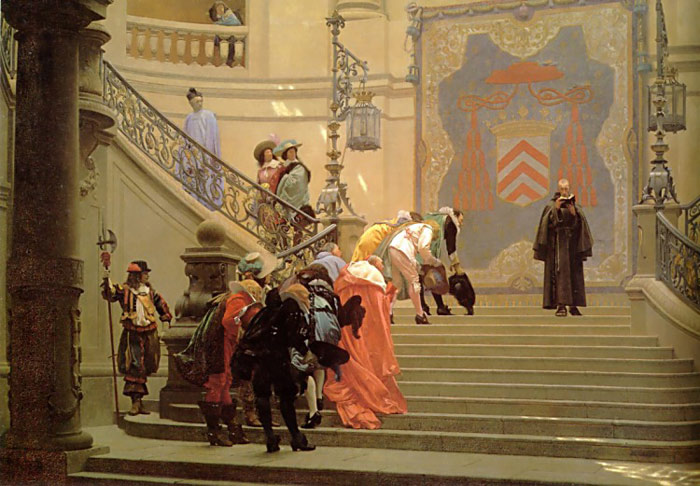
Informal composition radically moves the elements to balance without symmetry. 
The Grey Cardinal by Jean-Léon Géróme

Some do not understand how this works.  How can an informal composition look good if its not organized?  The secret is... it is organized, but not in a 1+1=2 sort of way.  Let me explain it to you.  It’s for your own good.  Really.  Some may dislike asymmetrical compositions merely because they don’t understand them.  This explanation should give you some visual “higher math” to feel better about most paintings, illustrations, and movies.  (Did you know that movies use a lot of informal shots?  It’s going to bother you now, isn’t it?  Well, I’d better get on with the explanation then....)

This is a formal composition:
The center of interest (the boy) is in the center of the picture.  The house and the trees on the right balance the tree on the left.  The path and the bridge and the trees behind the boy are all in the center of the picture.  

Yes, all you math-heads, though the tree doesn’t exactly mirror the house, though the path leans one way and middle trees behind lean another way, and though the bridge is at an angle, this is most definitely a formal composition.  Because of the variation some may think of it as informal; however, this formal composition merely uses informal elements for variety.  They still are arranged into a formal composition.

What if we took the center of interest and moved him off to one side?  (Yes, it’s just called the “center” of interest.  It doesn’t have to be in the center.  You just have to make people look at it like it is.)
He looks awfully lonely and the other side look really empty.  How could we make it look better?  I’m glad you asked.  Let’s get a little abstract.

First you need to know that everything in a picture does something for the composition.  I’ve color-coordinated some of these abstract elements and we are going to step through them quickly to tell you how they work.
The red object is our center of interest.  I like to call elements like these target objects, because they attract attention.  The blue object is what I call an arrow object.  The green object is a frame object.  And the yellow object is a halo object.  (Appropriate, eh?)

Since those colors and names do not tell you much, here’s more information on each:

Arrow objects point to stuff.  Ideally, they point to your target object.  They can point like arrows, or if they have a front they can face in a direction.  Arrow objects do the bulk of the work making our eyes move around in a painting.

Halo objects form a little halo around the target object to attract attention subtly.  They can be light, golden, dark, feathery, solid, or just about anything.  They circle around the target object, essentially saying, “Inside here is something special!”

Frame objects stop movement from leaving the composition.  This framing object is like a large halo, but instead of indicating something special, it says, “Stop!  Look back toward the target object....”  Sometimes frame objects act like halos, and other times they act like arrows, but they do a unique job in the picture.

So getting back to my picture with the little boy, what could I do to spice it up a bit?

First, I’m going to put in a large heavy arrow object on the opposite side from the boy in the picture.  Notice that as a whole—the bridge, the trees, the house, and the grass by the river—they form an arrow pointing to the boy.  Also, notice that both the house and the bridge seem to be facing in the boy’s direction.  These are both examples of how arrow object’s work, both as a mass and as individual elements.

Notice how this effectively shifts our attention from the big empty side to the boy.  In fact, it’s so strong, we tend to look off the left of the picture.  The target object, strong as it is, cannot effectively counteract the strong leftward momentum in the picture.

Second, I’m going to add in the halo object behind the boy.  This halo object isn’t the strongest use.  Many times artists use halos that compliment or contrast the target object.

Notice that while the halo object helps, it doesn’t solve the entire problem.  The left side of the picture still needs help.

Third, I use a frame object!  This effectively stops our eye from wandering off the page.

Oh, and last but not least... here’s the path.  Just so he’s not floating on air.  We wouldn’t want that, now would we?  And believe it or not.... the path actually compliments the composition further, but that’s a more advanced lesson.

In fact, this art moment just scratches the surface of how informal composition works.  Fine art, comic books, and movies subtly use value, color, space, and action in many ways to balance informal compositions.  The next time you see an informal composition, try to figure out how it works.  You might surprise yourself!  Email me about your findings.  Then I can enjoy reading your thoughts!