Blog Navigation:

2012/11/19

Spectrum of Art Styles


Every project calls for a unique style of rendering—some simple, some very complex.  The following pictures show some of the styles I've worked in over the past few years and how each ranks according to workload.  

Also, I'll show some illustrations for projects that haven't yet made it to the blog!  I hope you enjoy....


The sketch:

Storyboard for Jimmy Valiant: Scions of Danger - less than an hour

The sketch is a basic element of the artistic process.  Every work of art starts as a sketch, and sometimes—as is the case of storyboards—it stays in sketch form and is used as inspiration for something else, such as a movie.


The monochromatic oil sketch:

Storyboard for Ace Wonder: Message from a Dead Man - less than an hour

Sometimes a project calls for something a little bit more than a sketch—a value study.  Many works of art also go through the value study stage.  Some stay here (though this particular piece went on to be fully rendered in the style of a fine oil painting).  I usually use this rendering method to explore lighting, form, and composition.  It can give a sneak preview of what the finished work will look like.


The Promotional Sketch:

Concept art for Eleventh Hour - about an hour

Often a director wants something high quality to show investors, but may not have the funds yet to film a short trailer.  The promotional sketch helps fill that need by bringing the story to life in a fast and economical way.


Line and wash:

Read Everywhere - Self-Promotional Piece - a couple to a few hours

I've just developed some new digital watercolor techniques!  These allow me to create simple and powerful illustrations in the styles of  Carl Larsson, Jessie Wilcox Smith, Arthur Rackham, and other illustrators from the golden age of illustration.  I'm really excited about the possibilities with this medium.


Realistic cartoon:

Snowball - Self-Promotional Piece - half to full day

The realistic cartoon can really pack a punch.  On the surface it appears simple and sometimes funny, but that simplicity hides a deeper, more profound side.  A good realistic cartoon brings a depth that other styles cannot.


Matte Painting:

Matte for Remember - 1-2 days

A matte is a very detailed landscape painting.  Often a matte painter relies heavily on photographs, but good artists will paint as much or more than he uses photographs for.  

This matte painting used about 10 photographs, but each photograph was touched up and painted over, with half of the picture being pure paint to tie the images seamlessly together.


Finished Oil Painting:

Illustration for Olive Baptist's 2010 Christmas program - 2-5 days

The highest form of illustration, often a lot of time goes into making all the details just right and bringing out subtleties in color and value.  Most of my clients want this rendering style when approaching me for art.


Of course, none of these time estimations are exact—different projects take different amounts of work.  The content of the artwork affects the time it takes to render.  Here are some elements which tend to increase the amount of time:

A large number of characters, such as are in this piece from my masters degree, tends to increase the time.  However, these paintings with many figures can be very rewarding after all the work:

He Who Hath Ears - MFA painting 


When lots of information must be researched and visualized, like in this illustration, more time will be to correctly picture the abstract concepts:

Thylakoid membrane illustration for A Beka Book science textbook


Historical artwork will always take longer, because of the research into the setting, props, costumes, historical figures, etc.  :

Cover art for A Beka Book's 4th grade reader Liberty Tree


And finally, interactivity will also add to the production time.

Concept art for Founding Fathers Project interface


Creating illustrations is one of the most rewarding aspects of story creation, when the words come to life in a new way.  Let me know if you need any art.

2012/09/03

Me Painting Me


I made the mistake of telling someone that I had video of painting this self-portrait.  For some reason he wanted to see it.  So....  I dug up the video, edited it late on Friday, and just posted it on a break today.

Hope you enjoy!

2012/07/14

Matte Painting

Just recently I finished a matte painting for the movie Remember.  You can find out more by visiting their Facebook page or their website.  I'll post more about making this later.  For now, enjoy!


2012/06/08

Direct the Viewer with Faces and Eyes

Today we will talk about using faces and eyes in our pictures, or how to....


Thanks, Mr. Announcer guy!


Before I get into this, let's remember a couple basic composition principles:

Basic Composition Principles

We use some objects that act like targets.  They attract the eyes of the viewer.


We use other objects that act like arrows.  They point to something (often a target object).


A good composition should act like this: the arrow object points our eyes to the target and we viewers find our attention riveted on whatever that target is.  The goal is to develop a good "balance" in the picture.  We put the target in a nice spot for our eyes to rest within the picture.  We place arrows so that they point into the picture and not out of it, toward the target and not away from it.  


Principles Applied to Faces and Eyes

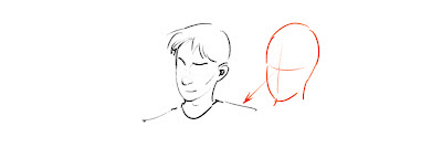
Faces are great example of target objects.  Artists and photographers like to use faces to attract attention.  We viewers usually don't mind, being partial to our likeness.  In fact, even if the artist does not intend for us to look at a face, the viewer will look at it involuntarily.  Faces innately attract our attention.


And yet, while faces always attract, sometimes they also double as arrow objects!  A turned head can turn our heads and point us in a direction.  


Perhaps its the nose that does the pointing....


The trick with faces is to "balance" the targetness and arrowness within the picture.  If a face is pointing in one direction, make sure it has space there to make up for the strong directional prompt.  If it is too close to the edge of the picture, it will point our eyes out and away!


The eye is a perfect example of a target object.  That dark center with the rings around it...  It can powerfully attract our attention.

And yet....


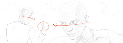
It too can powerfully direct our attention!  The eyes act as arrow objects most often in pictures, pointing at the object of interest.


Combining Face and Eye Directions

When heads and eyes direct the viewer's attention in a picture, they often act in unison.


With both pointing in the same direction, the artist does not have to worry about where the viewer will look.


However, sometimes the face and eyes act independently.


If you ignore the eyes here, the head is pointing down and to the left (his right).


However, his eyes point down and to the right.  (His left.)

A good rule of thumb is to let the eye direction overrule the head direction.  While we are interested in a person, we are more interested in what a person is thinking about.  When we see someone suddenly look in a direction, we sometimes catch ourselves involuntarily looking to see what caught their attention.


Again, this pose could confuse the artist.  Where is a good place to put this head in the picture?


The head is pointing down and right in the picture, almost away from us...


...but the eyes are pointing toward us and to the left.

Remember: eyes overrule faces.  Just wanted to make sure that you got that.


Practical Problem: Something's Stirring Out There

This picture has major problems.  It almost looks like random sketches—like the people are not really interacting.


The only reason that it somehow works is that the directional gaze of the two characters on the left is counteracted by the stirring woman's gaze.  Other than her self-consumed part of the picture, the two men on the left gaze strongly out of the picture.


A better picture might look like this.


By using the young man as the center of interest, and having both characters looking at him, the composition get better instantly.  All of a sudden the characters are interacting meaningfully within the picture.


If we turned the man's head a little, it helps even more...


Practical Problem: It's Alive!

Other than having a creepy mad scientist (or whatever he is), this picture also has compositional issues.  While both of the men are looking at the object of interest, that object is too far over in the picture.


The test tube that the assistant is holding acts as the target.  (It doesn't look like one... but don't think about that, right now.)  Unfortunately for this picture, the test tube is too close to the left edge.  With the strong directional gaze from both of the characters, the effect is very powerful.  The test tube is not a strong enough target, and the strength of their look carries the compositional force out of the picture.


If we merely flip our lab assistant around, the composition instantly gets much better.


The test tube is in a much better spot, compositionally.  Both gazes now intersect on it, creating a much better picture.


Also note: if we change the assistant's gaze just a little bit, the composition changes.  The assistant becomes the center of interest, and the picture now becomes a story not of a laboratory surprise but of the character differences between the mad scientist and his assistant!  Always look for ways for the people to interact in your compositions.


Practical Problem: Off Center

Ok, one last compositional problem.


This one is interesting because each of the faces acts as targets.  


However, the eyelines create problems, leading eventually out of the picture to the left.


If we move a couple of the eyes, we can make a different dynamic in this picture.  Almost a circular pattern... around and around...


By doing this, the little guy who is trying to play basketball becomes the compositional center, creating a fun dynamic of personalities.


Addendum

Of course, the artist can break the rules.  You just can't find an inscribed stone proclaiming, "Thou shalt balance the eye and face directional forces within your picture's composition."  

Especially in sequential art (comics or animation), movement over time allows artists to experiment with misdirection and other compositional tricks.

However, break the rules at your own peril.   Your picture may suffer the consequences....


Beware.... beware!

2012/04/20

Early Fog Imaginair


I'm in Illinois visiting my grandparents and helping out a little on the Sample family farm.  But on my way to the airport on Tuesday, my dad and I drove through some beautiful fog.  I couldn't feeling awed at the beauty and painted this during a layover in Atlanta.  Dawn is one of the best times to observe and remember, just because of all the interesting lighting effects that happen.  Here's a dark one.  :)

2012/03/23

Imaginair: Sunrise Over a Florida Bridge


As I was driving from my grandparents condo in Orange Beach to the Blue Angels' practice session at the Pensacola Naval Air Museum on base, I saw this lovely sunrise behind an interesting bridge.  I couldn't paint it, because I was behind the wheel at the time.  So I memorized the colors, the lighting, the general composition, and as many of the details as I could, and painted it later.

I enjoy painting many of my artworks.  This one stands out above many of them as being even more enjoyable than normal.

2012/03/07

Eating Dirt


Here's a little sketch with a bit of Sample family lore behind it.  A true story from when my brother and sister were a bit smaller.  Great example of my sister being helpful, feeding my very young brother dirt.  My mom thought it was cute, and made sure it didn't happen any more!